architecture

Sunny Acres Residence by Gregory Upwall

Moab, Utah is known for its phenomenal sandstone formations and vast open space for outdoor activities. The clients came to us with this site set amidst the beauty of the desert landscape surrounded by panoramic views. When we first visited the site we were awestruck by the beauty and grandeur of the red rock cliffs, valleys, and canyons that create a stunning and magnificent setting to behold.

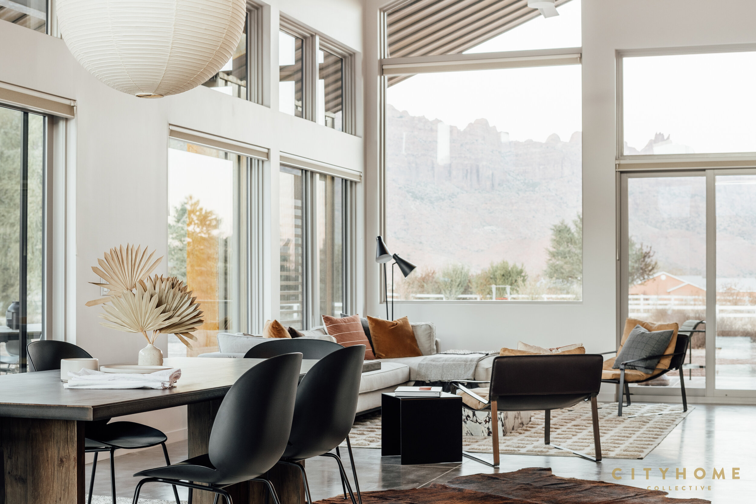
There are certain projects where the relationship to the site is essential and this project was certainly one of them. The 2,000 sq. ft. home is simple in function and form with an asymmetrical gable roof volume that is extruded along the main axis of the house to form an exterior shroud that protects the interior spaces from the harsh desert climate. The orientation of the house on the site aligns with the sun’s path. The long axis of the house is focused to the east toward the point where the sun rises over the La Sal Mountains and to the west where the sun sets over the southern Utah cliffs. The common living, cooking and dining space of the house is located within this volume, allowing occupants to experience the sunlight as it moves through the space throughout the day.

moab-modern-design-3.jpg


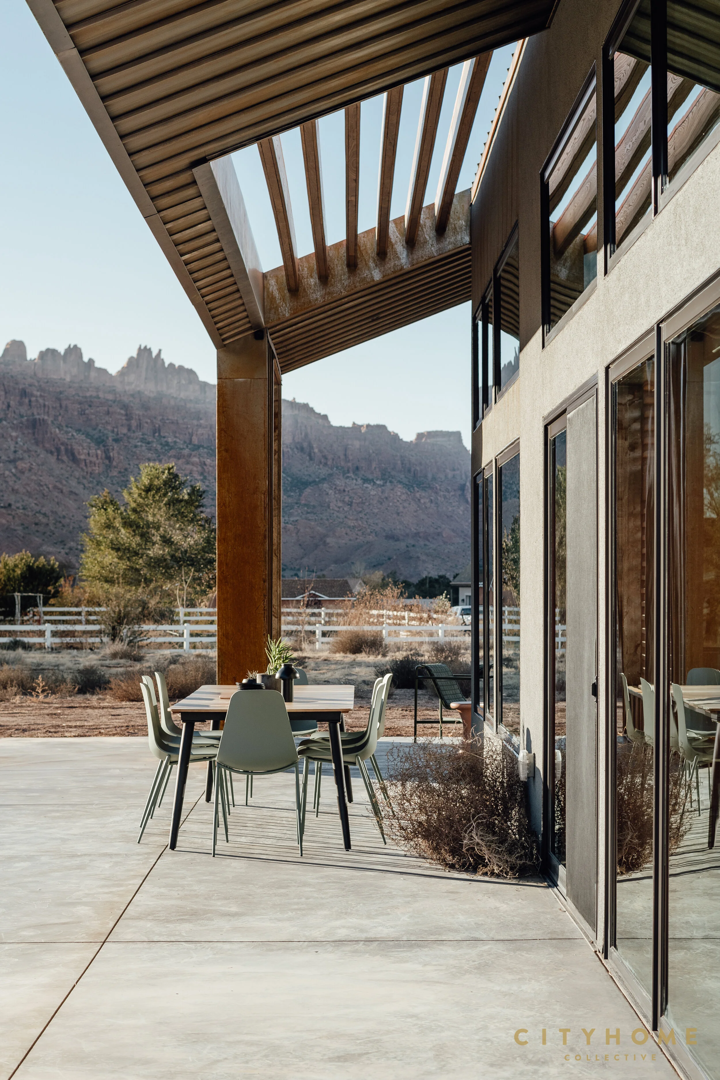
The material selected as cladding for the large exterior extruded roof form is a natural steel panel that is allowed to rust on the surface, creating a patina and pattern that references the red-orange sandstone cliffs. Weathered wood boards are placed around the doors and windows providing a similar but softer texture in the areas where one enters the house. The concrete floor slab is continuous from the interior to the exterior to reinforce the sense of continuity from inside to outside.

The southern wall, punctuated with a series of glass doors and windows designed to provide a connection to the landscape and panoramic views, is set in under the deep overhang of the roof to deliver shade in the hottest months. There is a hidden loft set at the top of the volume accessed by a simple ladder that offers an ideal space for reading and reflection. The bedrooms and bathrooms are all aligned along the lower north side of the house that has smaller horizontal windows to create view portals while retaining a sense of intimacy and privacy.

moab-modern-design-25.jpg
moab-modern-design-14.jpg

Sustainable strategies played an important role in the design of the house. Studio Upwall collaborated with Eco Logic Design-Build who specializes in high-performance construction. They were able to minimize the environmental impact of the house by using structurally insulated panel construction, energy recovery ventilation, radiant floor heating, etc.

The garage building, designed as a similar volume as the main house was clad in the same patina steel panels.

moab-modern-design-13.jpg

Photos and Interior design by: City Home Collective

DC Rowhouse Renovation - Design Approach by Gregory Upwall

Design, Space Constraints, Goals

The proposed design, retains the original front facade.

This old rowhouse, like so many that our clients come to us with, was compartmentalized into small cramped rooms and was lacking for natural light in the interior. (It was what they call a “Wardman style” here in DC – but in this case, a mini-Wardman.) (insert link about history of Wardman style) Since the house was so small (less than 400 square feet per floor on each of the existing three floors) we knew right away that an addition to the house ranked high on the wish list (see “Pop-ups” & “pop-backs” below). After a few months of exploring different design ideas, we arrived at a scheme that will add a new upper level 3rd story to the house along with some modest additions on the back of the existing house. The selected design aims to open up each floor of the house by removing many of the internal partition walls on the living levels and by creating an open stairway that will bring in daylight from a three-story glass block window that will be inset into the existing west-facing alley-side wall. Glass block is a good choice for this location due to it’s inherent durability, and its ability to buffer sound better than most window wall systems. We also liked glass block since it is still a masonry (modular) product and we felt it to be a more complementary material for creating a large glass opening in the 100+ year old wall.

Expanding the Envelope: “Pop-ups” & “pop-backs"

Proposed rear design showing new upper and rear addition.

As mentioned, this house was small – about 980 square feet total in 3 levels. If ever there was a time where a vertical addition (aka “pop-up”) or rear addition (“pop-back”) made sense, it was here. We have successfully designed several of these additions for other clients – and yes, we know that this is a touchy topic for some out there. Our feeling on the subject is that these additions are not, in and of themselves, either good or bad. There are well-designed additions – and well, those that should have never been allowed to be built. These additions should always be set back from the existing architectural features of the house, which should be preserved. When designed correctly, and in deference to the original façade and historical features of the house, these additions are an opportunity for great creativity and possibility in revitalizing old housing stock in a city faced with rising property values and a shortage of good quality housing. We also believe that the added density created by these additions is an important component of sustainable redevelopment. By adding square footage, bedrooms, or even additional living units to existing buildings we are doing so without putting a strain on new infrastructure (roads, utilities, services) that is typically associated with new housing developments. In fact, in our opinion, zoning regulations for cities like DC with so much existing single-family housing stock, should encourage this kind of increased density – the new DC 2016 Zoning Regulations landed somewhere in the middle on this topic (more on this in a later post). With well-designed additions to existing stock, we can create within our existing neighborhoods, more living space and more opportunities for families and individuals to live together within these revitalized neighborhoods.